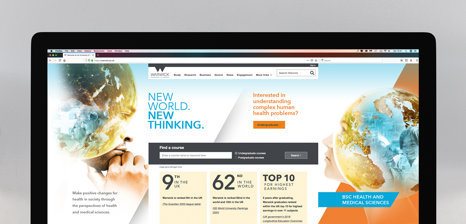
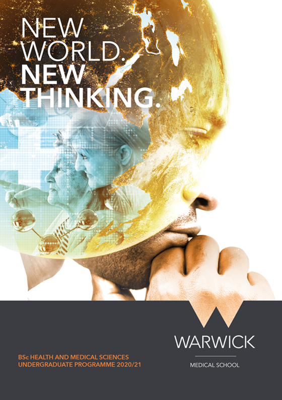
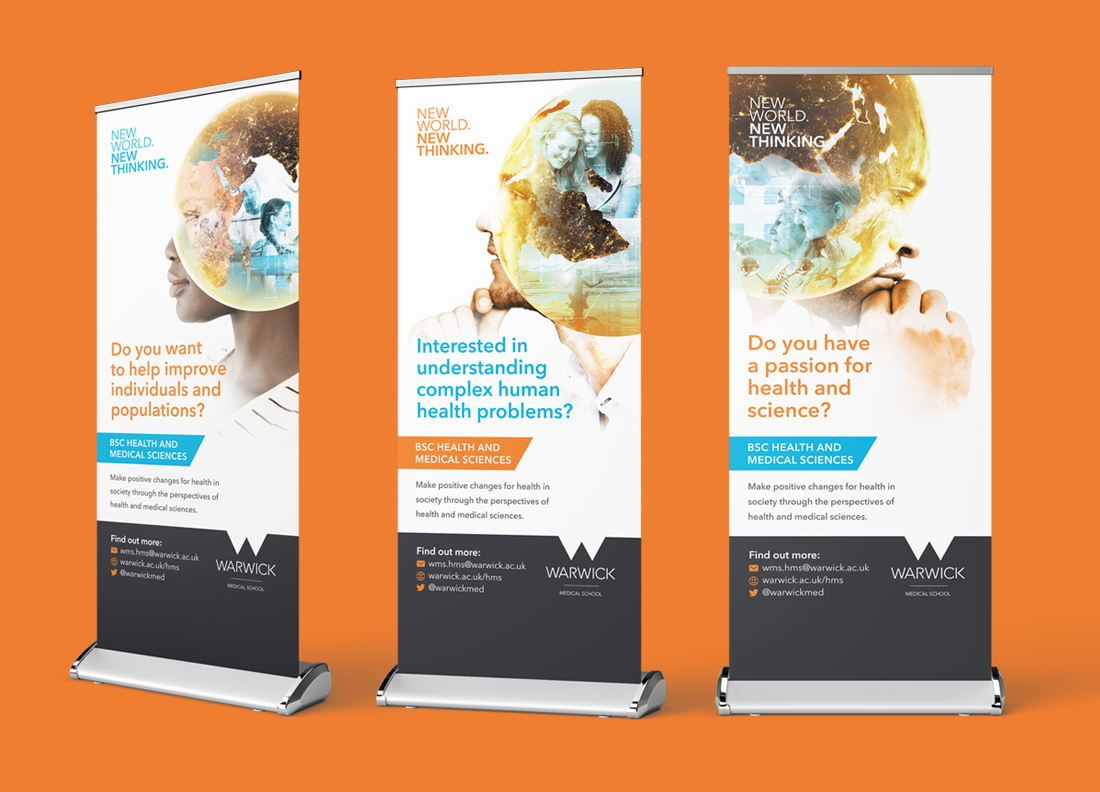
The solution had to work within the existing framework of Warwick University’s branding while evoking excitement and curiosity in potential undergraduates. The design draws parallels between the neurons of the mind and the global network of medical professionals, as well as representing the end user – the patient; unifying a complex, multi-faceted subject into a succinct, inspiring hero image.
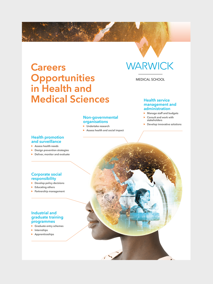
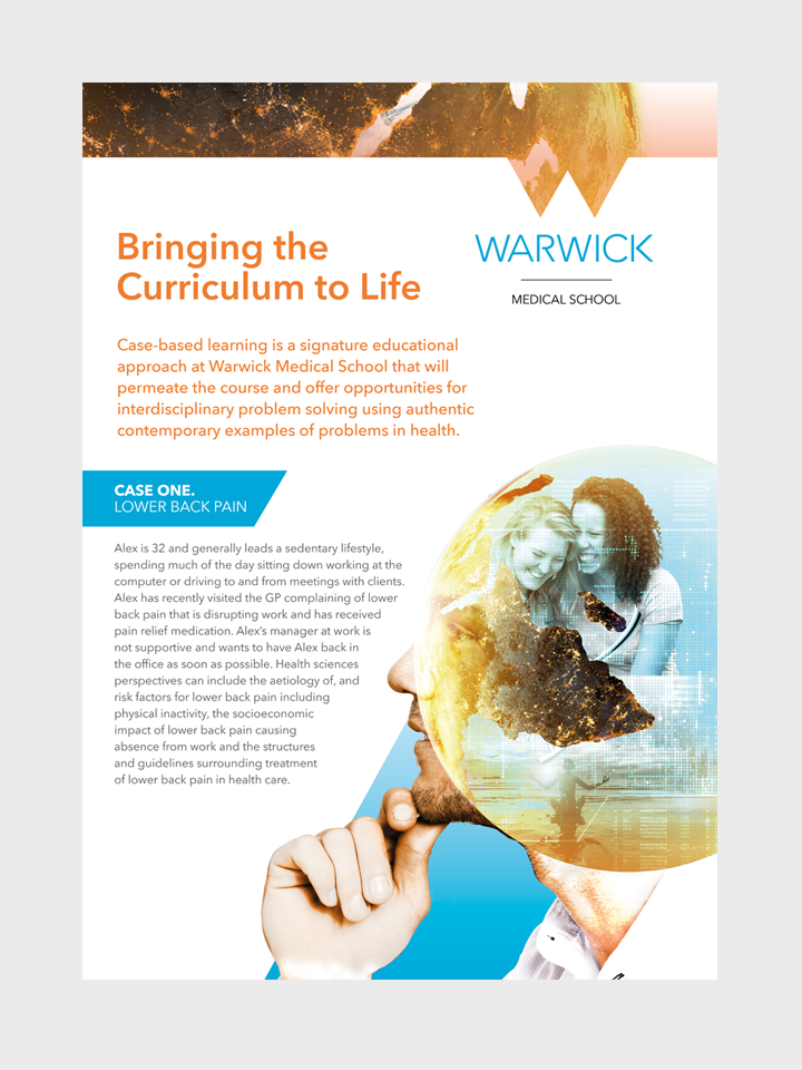
Working with the inherited palette of orange and blue required a light touch to lend the campaign a clinical look that was true to the subject of Medical Science. The imagery also had to work across a variety of applications while still retaining the necessary impact and recognition.