
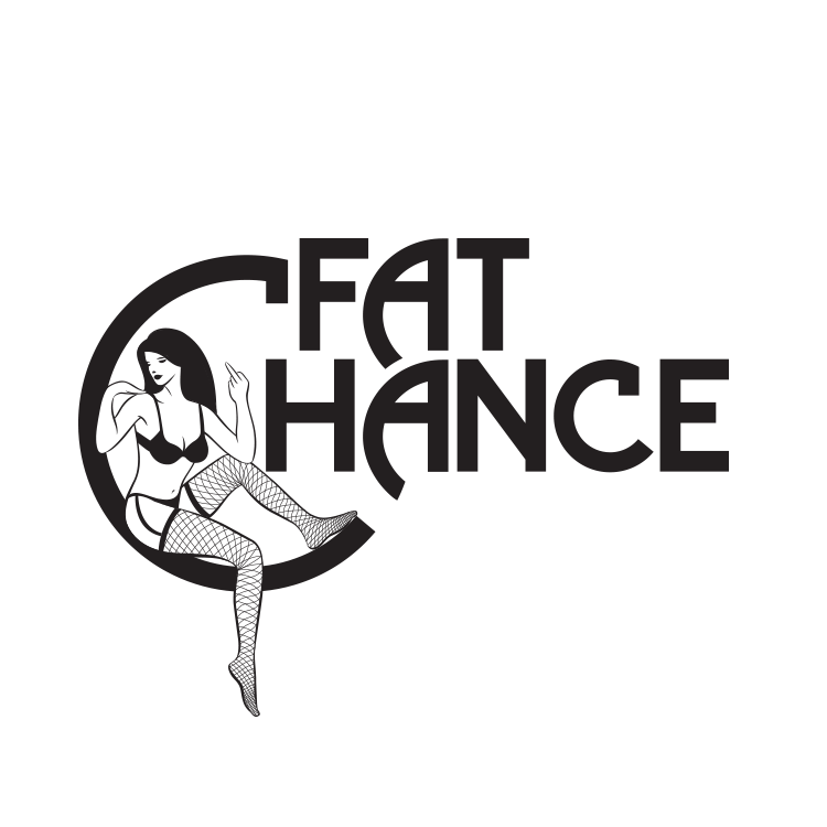
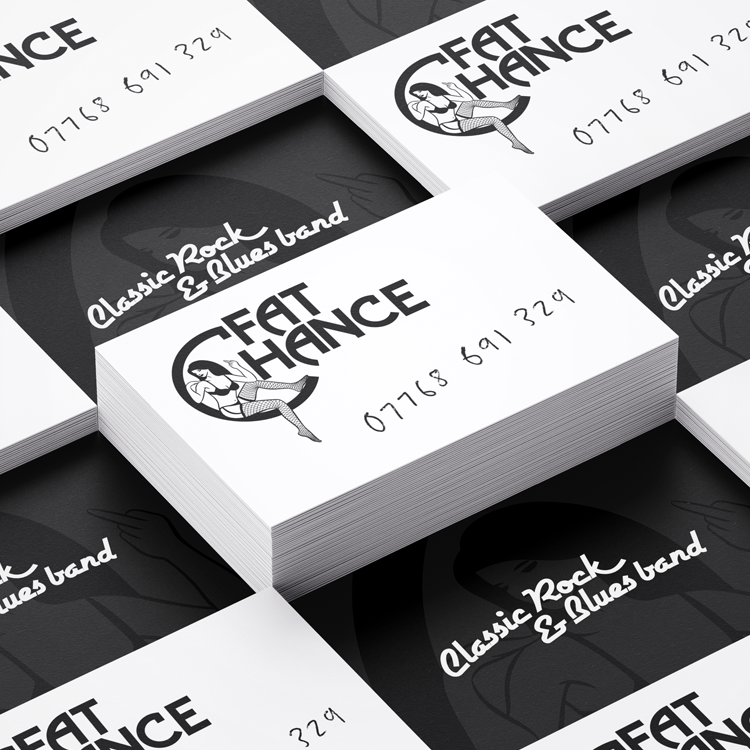
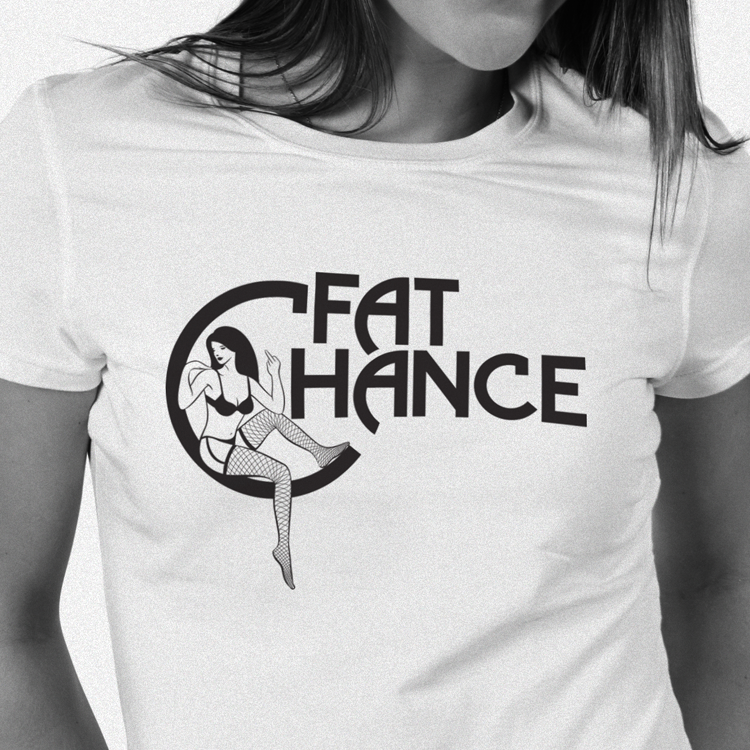
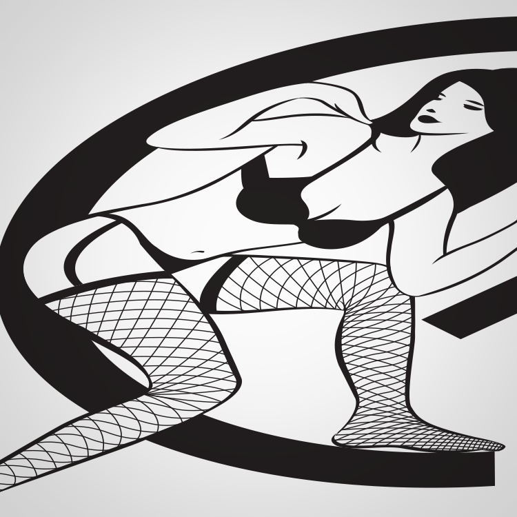
A middle-aged rock and blues band with a self-deprecating sense of humour, the name was a gift, I just had to run with the joke. The logo makes the well-worn connection between rock'n'roll and sex, but subverts the trope through the disinterested pin up atop a heavily 70's Clapton-esque typeface. Taking it one step further, the contact details were scrawled across the card as if handwritten at a gig, despite there being 'fat chance'.

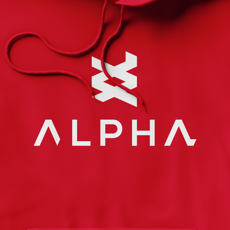
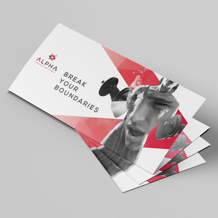
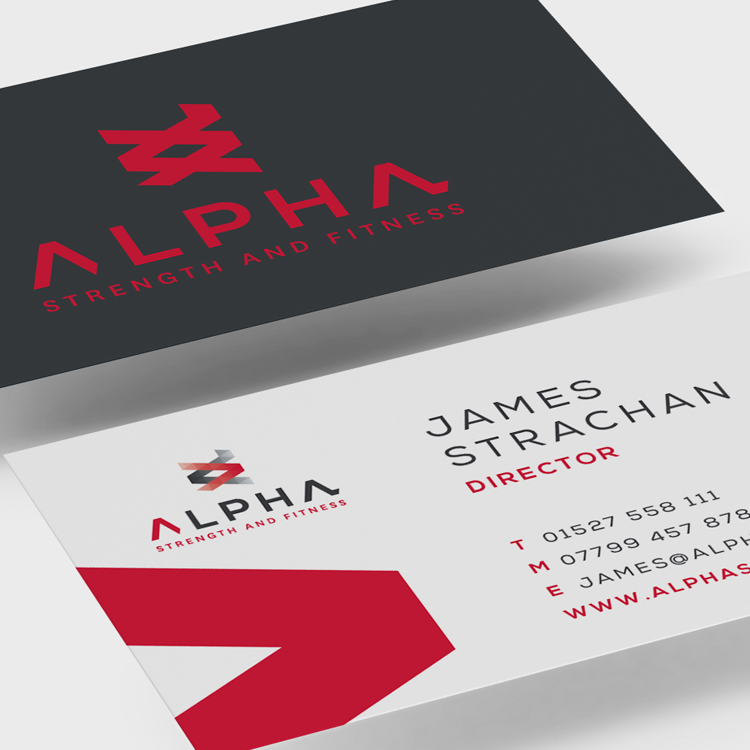
A high-end health and fitness company, this identity was born from the debate of nature vs nurture – are you born alpha or is it earned? A double helix, created from the two 'A's of the name provides an iconic mark, with one strand highlighted to imply motion, moving forward, of transcending your genetic limits. The brand is underpinned with the proposition 'Break Your Boundaries'.
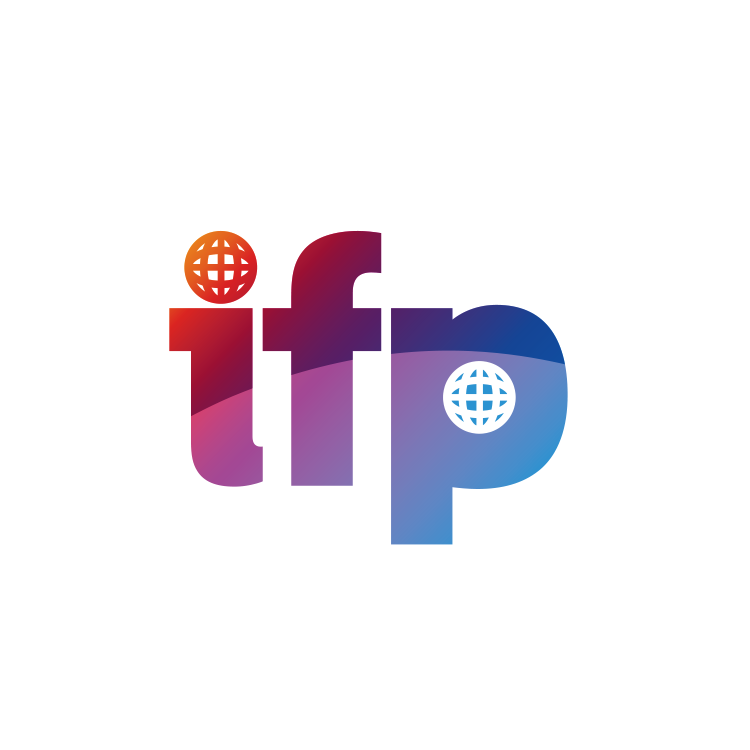
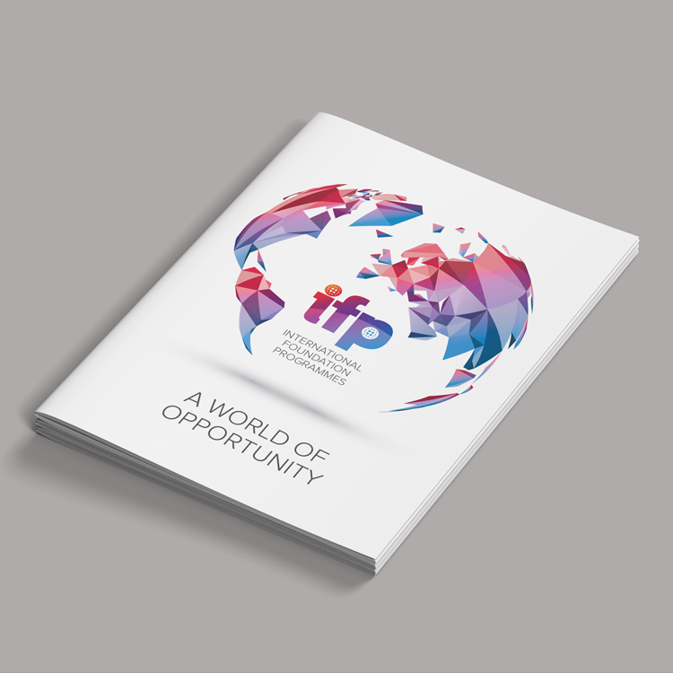
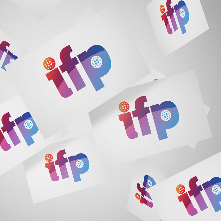
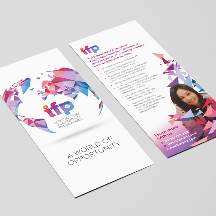
The International Foundation Programme offers domestic courses for students from overseas. Using negative space to illustrate moving one place to another forms the basis of this mark, with a subtle horizon added to further emphasis the international nature of the client. With potential students coming from all over the world, the literature is clean and concise, supported by inoffensive, culturally neutral graphics.
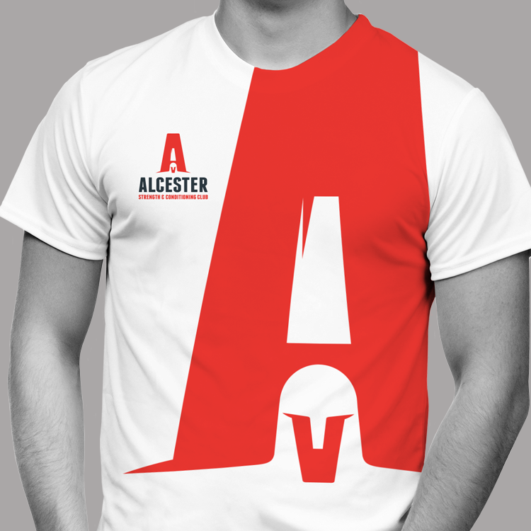
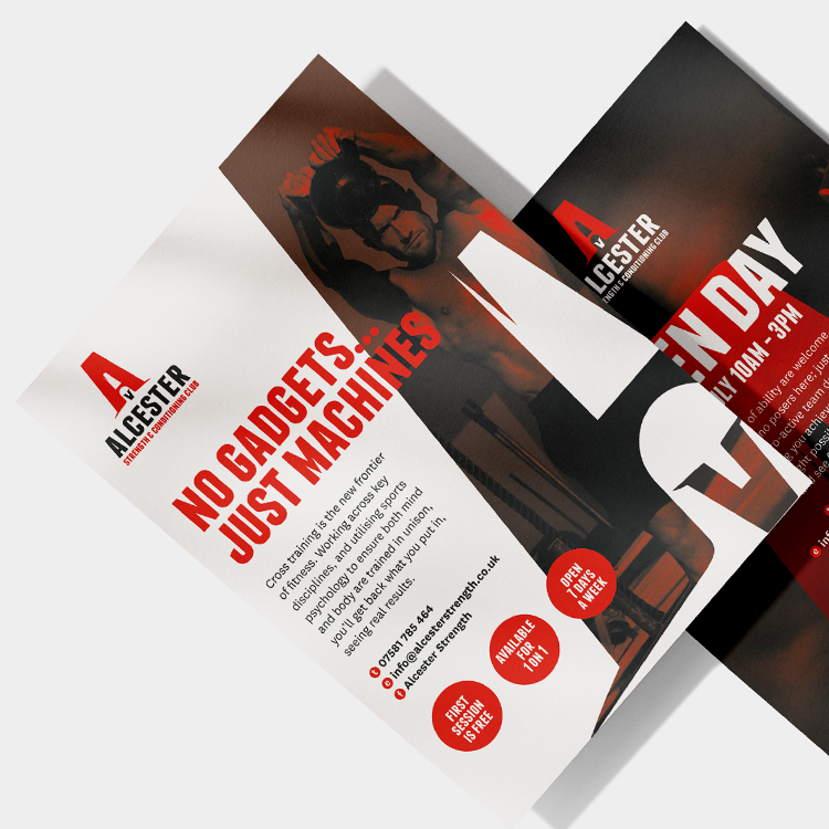
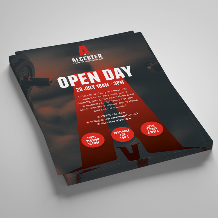
A heavy-set, masculine brand, with deft use of economy of design forming a spartan from the typeface. Evoking the warrior spirit is synonymous with the ethos of cross training – a pared back fitness system that dispenses with the trappings and gadgets of a modern gym.