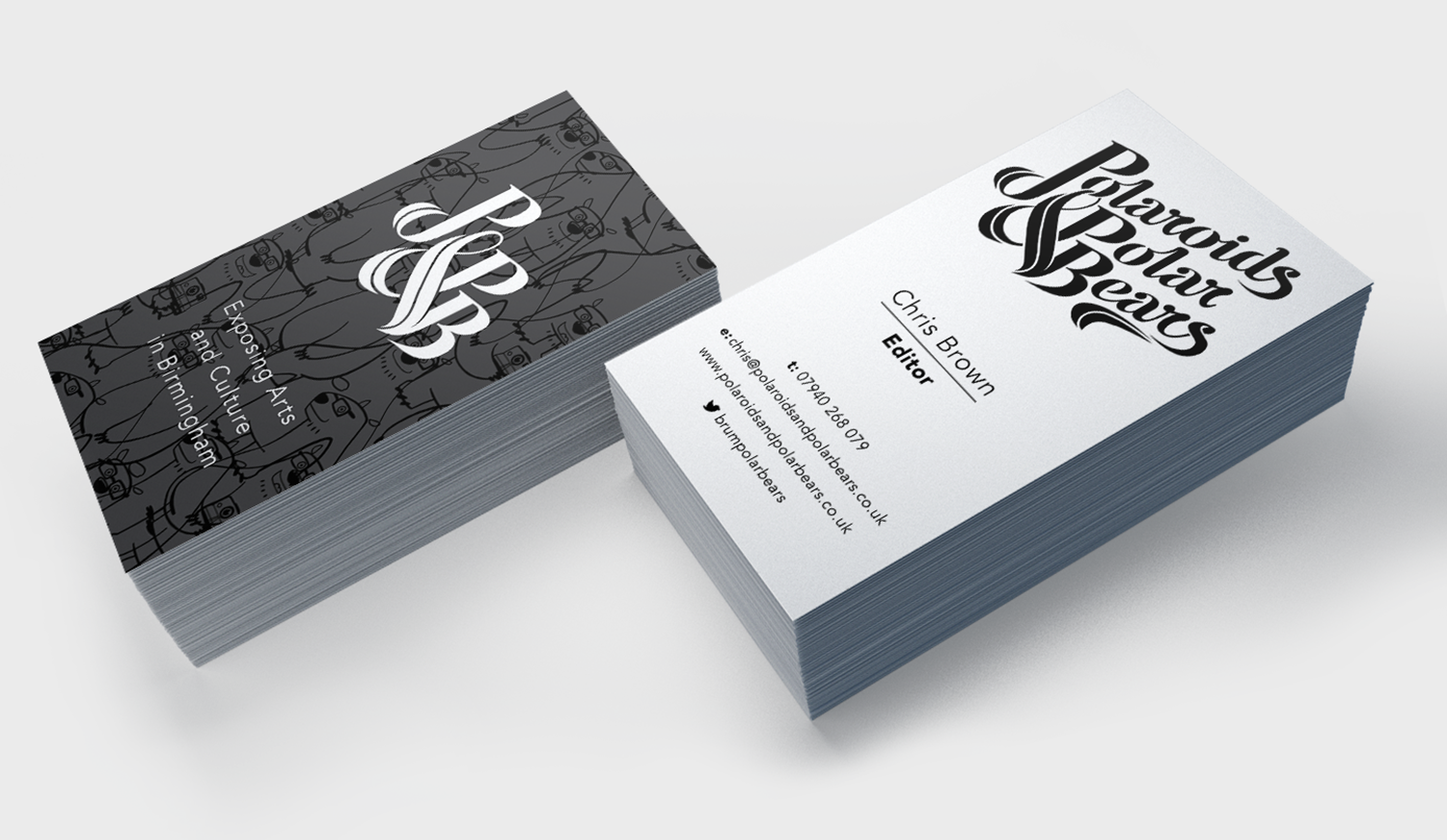
With such an unwieldy name to tame, I let the problem become the solution, creating a hand-crafted typographic mark that celebrated the uniqueness of the name with creative flair. The mark was further distilled into a classic monogram design, helping to balance out the cartoon mascot – highbrow but fun.
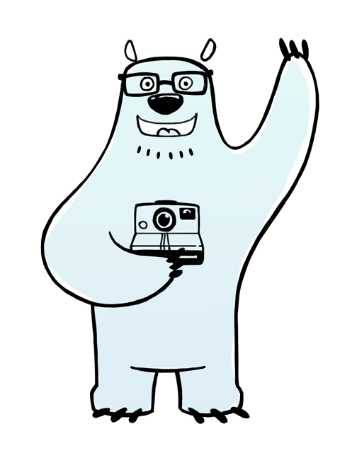


A mascot is a powerful marketing tool providing it's executed correctly – personable and recognisable can easily become passé and trite. Simple, clean and treading the line between cartoon and design, the solution is empathetic to the subject matter, of culture and fun. Weaving in a further layer of relevance, his name is taken from a well known Birmingham cultural hot spot and 'Baskerville' is born.

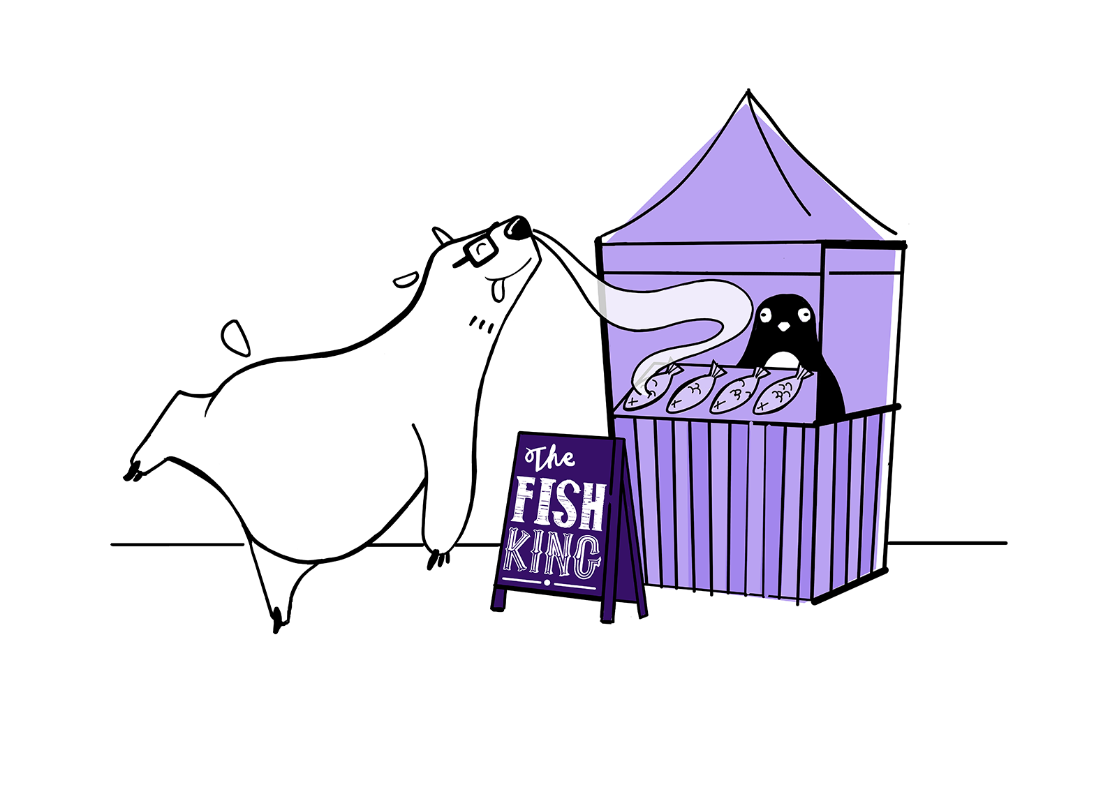
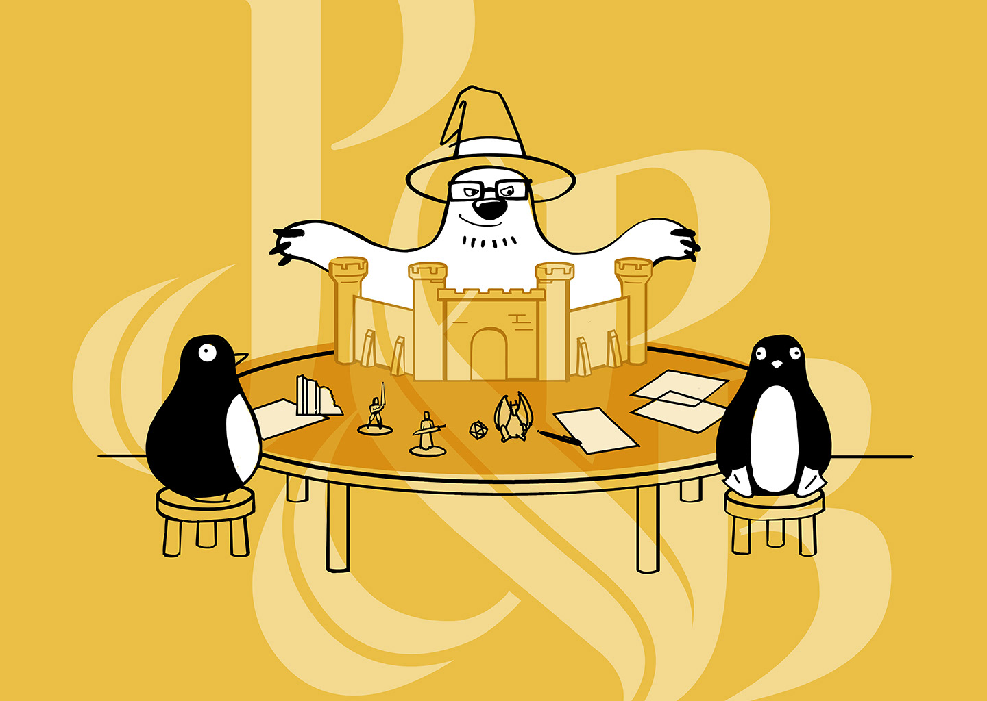

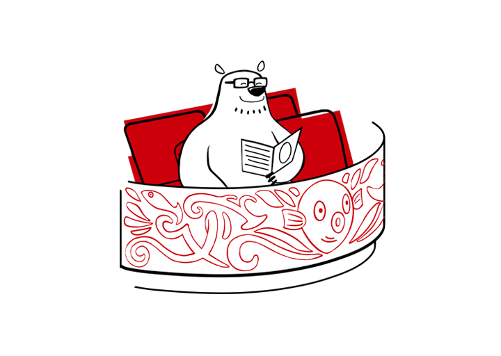
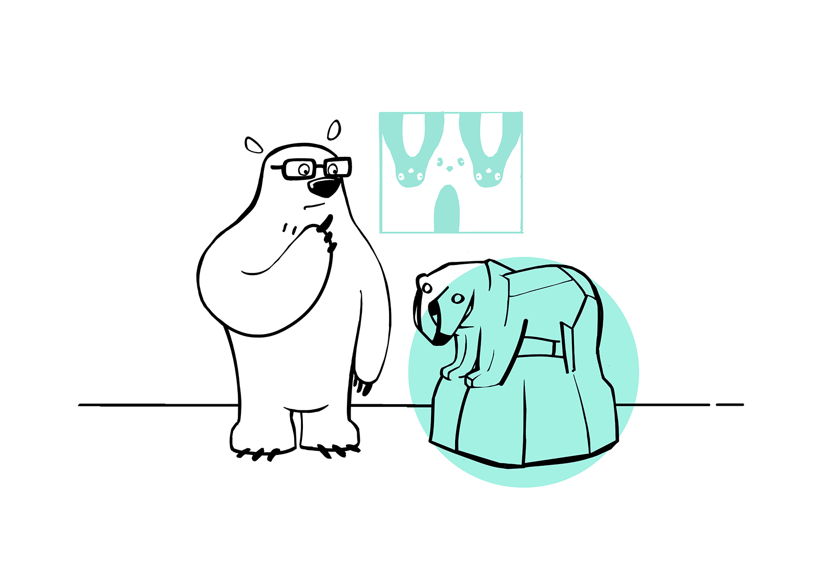
Showing Baskerville in various situations not only engenders relatability, but serves to help the brand organise the wealth of different events covered, using bold colour ways to distinguish specific categories – food, tabletop gaming, music, theatre and visual art.