The Four Corners logo is both a literal and abstract interpretation of the name and nature of the client. Representing the roofs of a housing development, the motif is also broken down and reapplied across the entire brand, creating areas of interest and leading the eye with efficiency and precision.
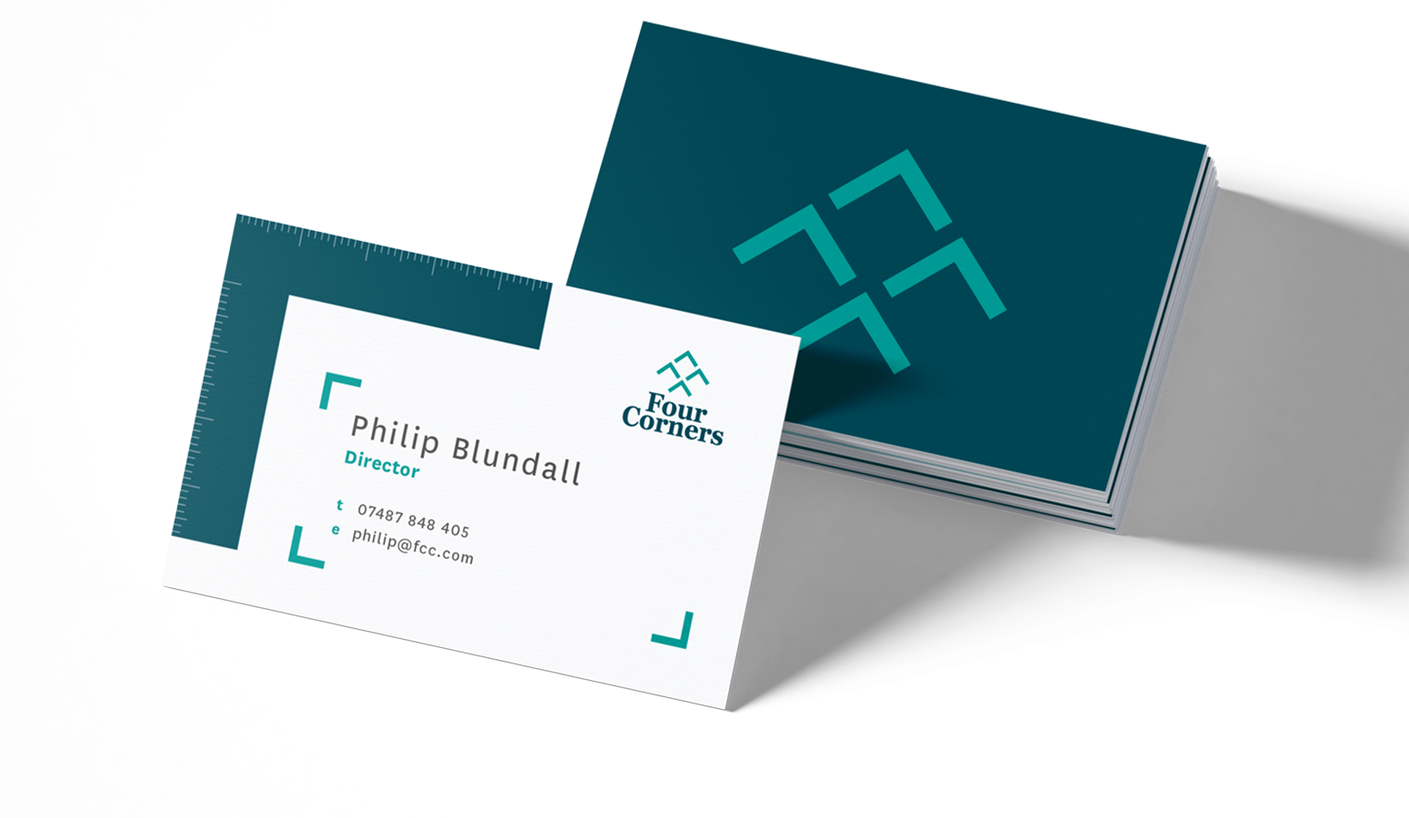
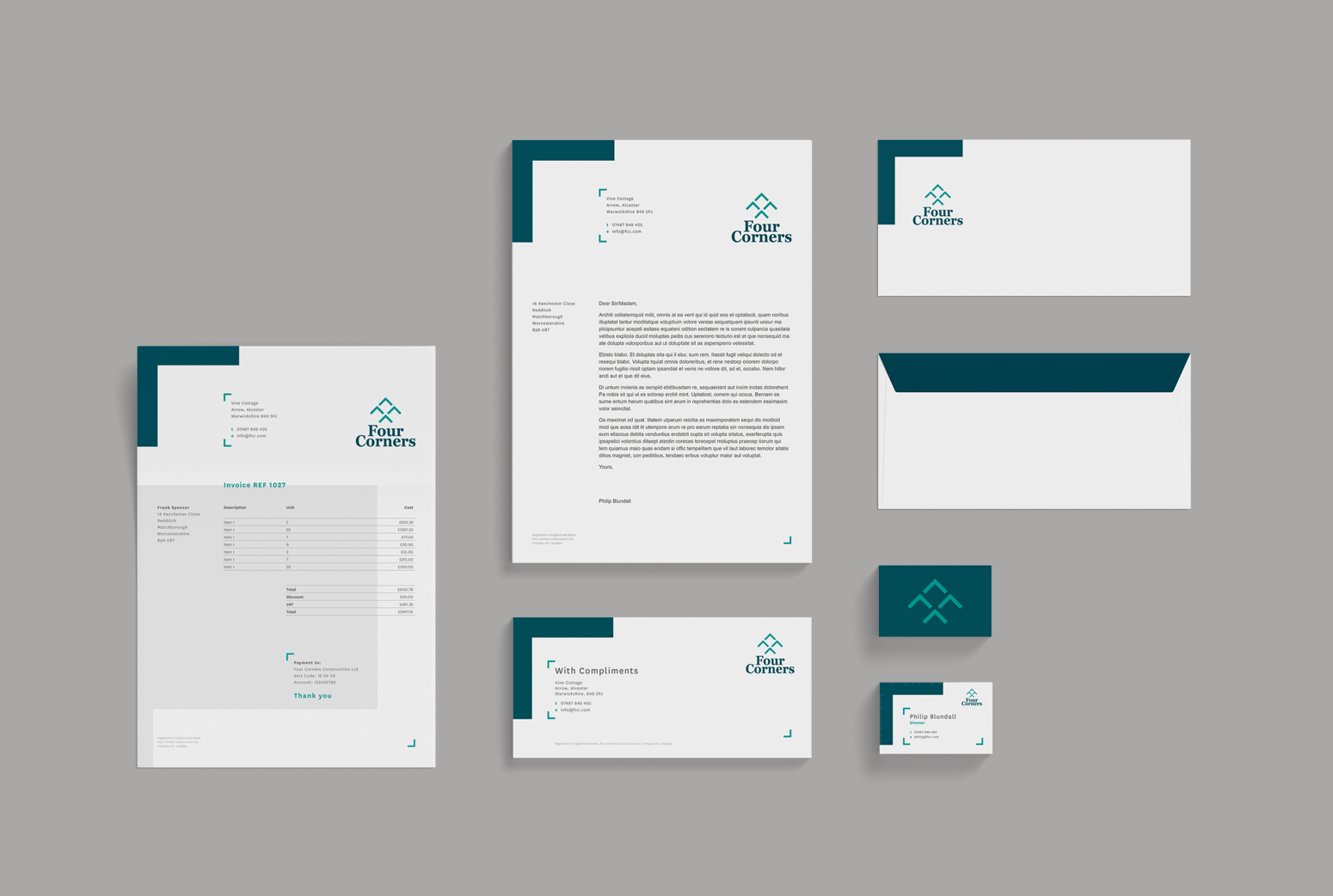
Doubling up the dominant corner as a builder's square was a nice touch for the business card, adding a useful function highlights the practicality of the client and more significantly, increases the chance of the card being kept.
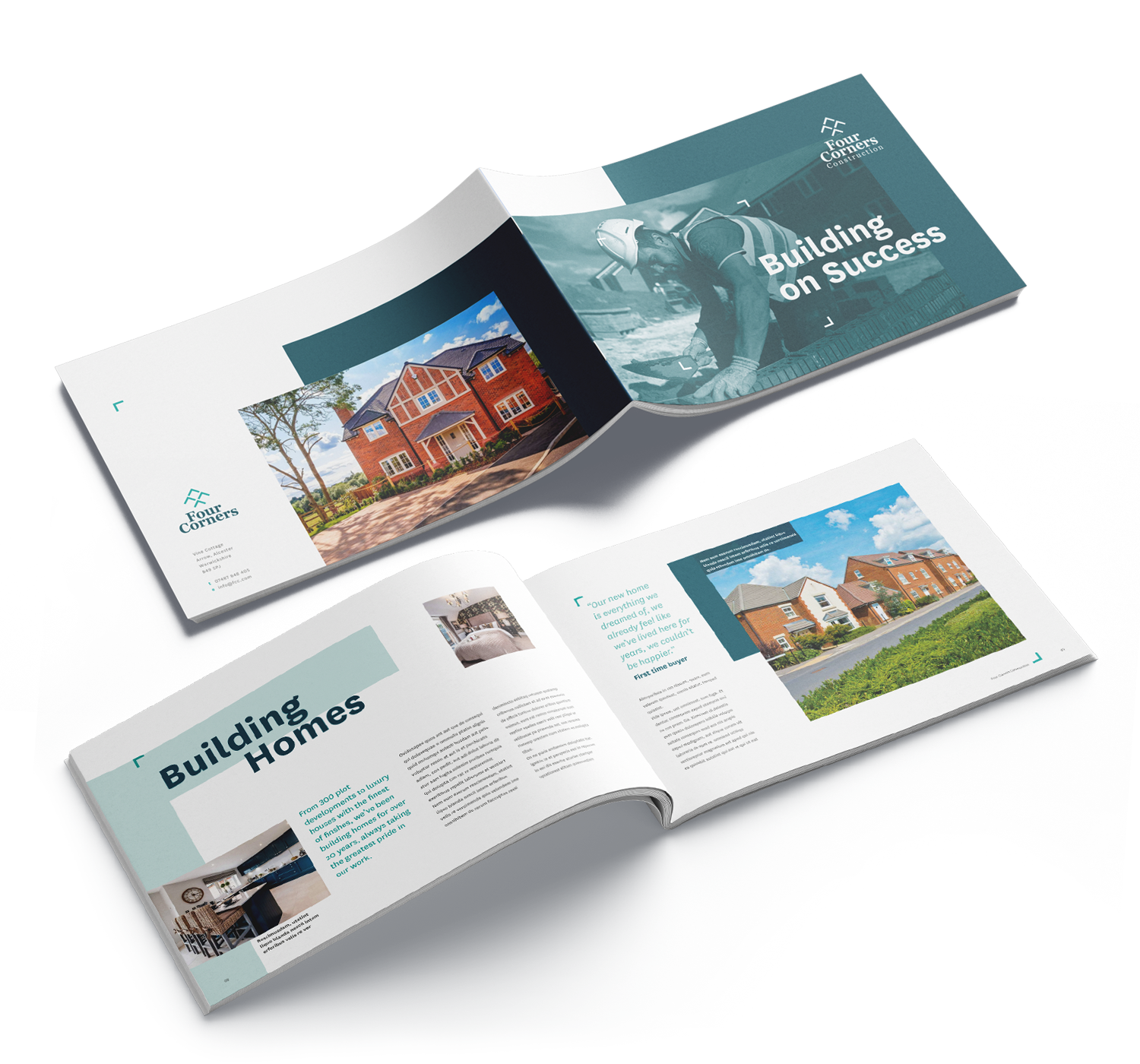
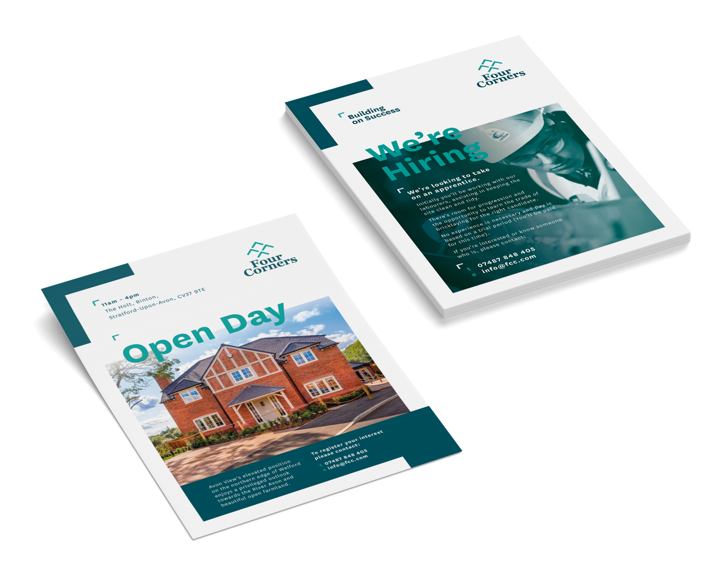
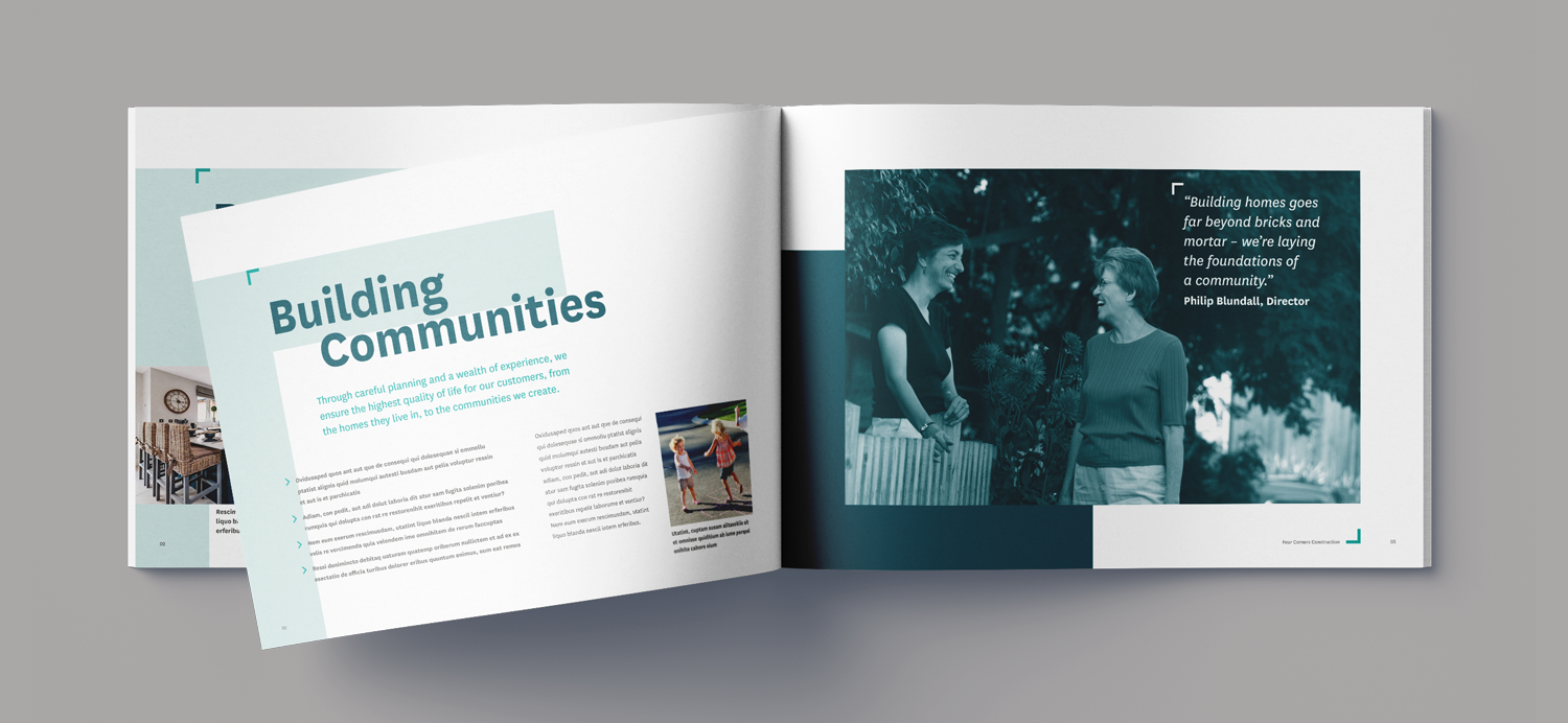
An A4 landscape brochure formed the backbone of the initial marketing literature, helping solidify the brand. The minimalist layout is built around giving prominence to photography, letting the images breath and the product speak for itself.
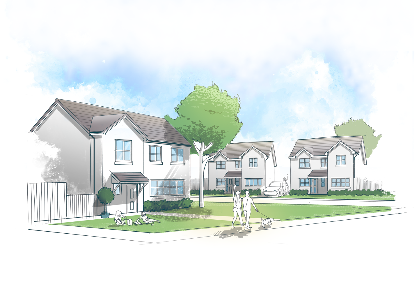
A stripped back, graphical style for artist’s impressions was also developed to complement the brand, continuing the effortless clarity of communication.

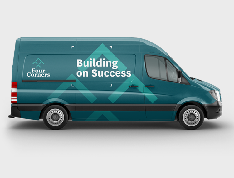
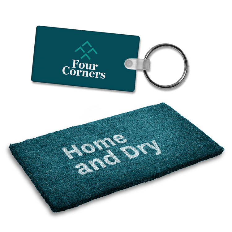
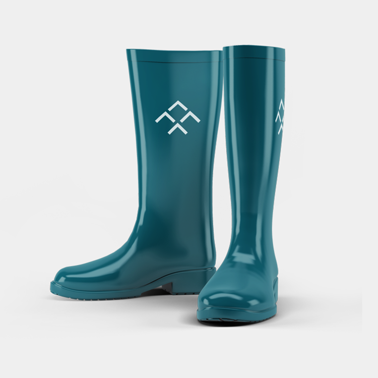
An expansive suite of collateral was designed to support the brand, from the conventional through to the unexpected.