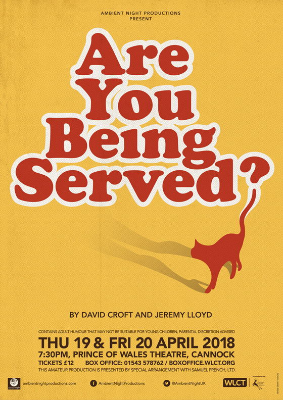

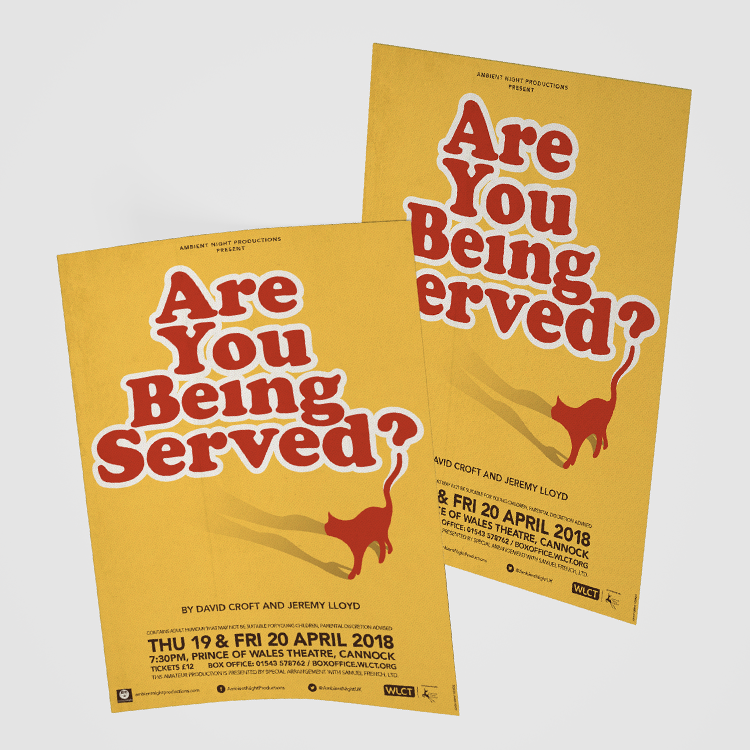

Kitch, playful and with a knowing nod to Mrs Slocombe’s well-loved feline friend, the simplicity and wit of the design provided the immediate cut through required in a noisy marketplace. Accompanied with a garish colour scheme reminiscent of the humour and era of the play, the design was a great success.
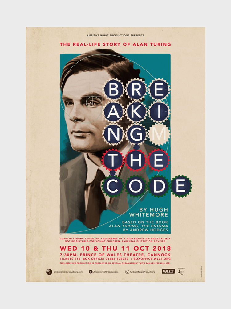
The tragic story of Alan Turing requires a respectful, sombre approach – utilising the muted colours of wartime posters provides the necessary tone. The cog theme presents the link to both his ‘Bombe’ computer and the machinations of a brilliant, logical mind, while the ‘E’ of code deliberately sits outside the box to represent a breaking of the code, of conformity; along with the word 'breaking' being literally broken.
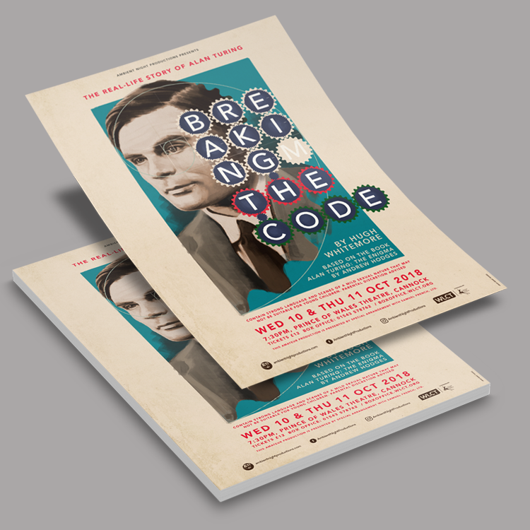
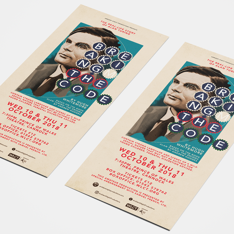
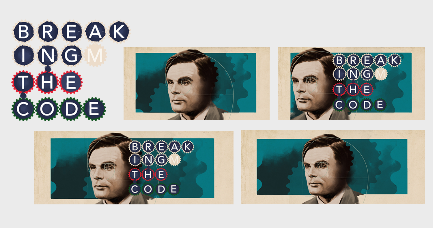
The entire composition is founded on 'The Golden Ratio' – the application of mathematics to decipher nature, about as relevant as you can get to Turing. Another touch was the introduction of the errant 'M' – it struck me that all the letters for 'ENIGMA' were present except the 'M'. Balancing legibility while breaking a word and introducing an additional letter was a delicate problem, but one worth solving.
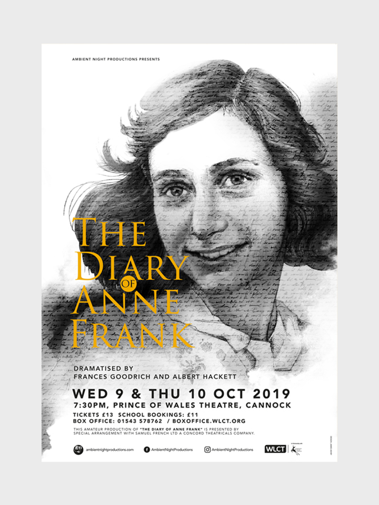
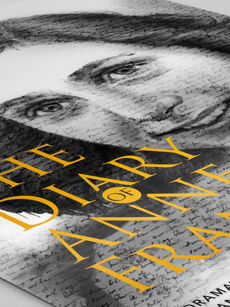
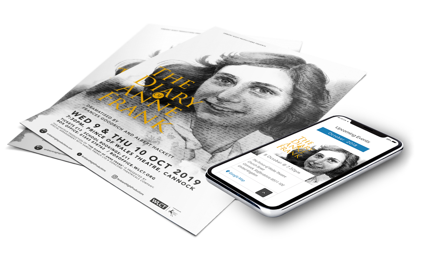
Another solemn tale, the story of Anne Frank called for a compassionate, earnest visual. Opting for a traditional pencil illustration provided the right emotion, with her handwriting overlaid on top echoing the diary itself, the image of Anne coming to life through her written words.